Even industry veterans with years of design and coding experience struggle when faced with the prospect of responsive website designs. This is due to the complete gear change in how one thinks about these newer layouts.
Before creating your first design for a responsive website, consider following these five guidelines:
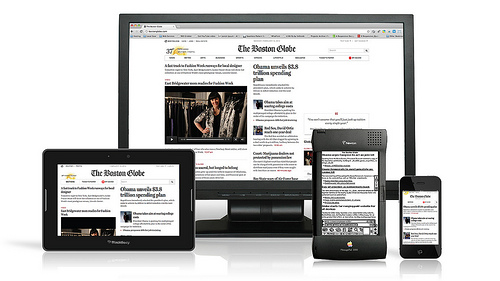
1. Screens Come In All Shapes and Sizes
Choose only a few different screen resolutions to target at first. If you attempt to accommodate every single screen resolution out there, you’ll have a hard time getting the website design done. Therefore, you ought to focus on the four following common screen resolutions: the wide-screen display of a desktop computer, the screen of smaller desktops and laptops, tablets, and mobile phones.
2. Optimise Content
You shouldn’t just use zoom out or zoom in and call it a responsive website design. You should take the time to optimize the layout of the content as well.
Always remember how a typical mobile phone user will utilise the compact screen area available to them. Just providing the power to zoom out to see the whole page might be the 1st option to consider. On some display screens such as the Apple Retina this makes sense, as the content is still decipherable, but lowers readability down for many other smart phone end-users on reduced resolution screens.
Instead of the zooming out option, experiment with techniques which will make smart phone users love to interact with your website design – limiting columns can really help with this.
3. Mix Up Content
A typical browser on a desktop working at their office is going to have separate information needs to a smart phone user searching on the bus. Change the stuff you provide to each kind of user to suit their individual requirements.
For example, if a person is using their mobile to check out the web site of a restaurant, it’s likely that, they’re trying to find the street address and the opening times. Therefore, you should make this information very simple to find.
On the other hand, someone using a desktop to check out a restaurant’s website is probably deciding whether they want to go to your restaurant. Hence, you should concentrate your content on convincing them to go dine at your restaurant.
4. No to Fixed Width
Use fluid grids to make a “liquid layout” instead of a set width layout. Most web-site designers find fixed width layouts, which are customary, much easier and more effortless to make. However, the application of fluid grids will be more convenient in the long term when it comes to responsive website design, since they’re thoroughly designed to consider proportion.
5. Coding for Media Queries
Understand how to code media queries and use them for your responsive website design. As a consequence of the huge volume of different smart-phones, desktops, and laptops out there, it is nearly impossible to produce a website design for every single one.
If you have two devices reaching your new website design, one with a wide screen, and one with a small screen, you can offer a different style-sheet for each device. Media queries provide statistics on the screen resolution from the device, which then trigger the correct conditional stylesheet to give the best user experience.
Creating a page whose design is responsive can seem daunting initially, with so many different parameters to carefully consider. Follow the techniques outlined above, and you really should feel a lot more comfortable about attempting your very first responsive website design.
Geoff works with Thunderbolt, a web design agency in Surrey, and loves keeping up-to-date with the latest digital trends.