Now your website environment is setup and you are ready to go, let’s stop and think for a minute about designing your site. It’s important that you design the site with usability and user experience in mind.
You often hear designers say ‘I hate how all stores like the same, it is so boring’. Well there is good reason for this. The formula is understood and it works, it doesn’t mean your store has to be ugly or boring, but while expressing your creativity and making your store reflect your brand and your personality, you have to keep in mind what your customers are used to and what the experience will be on your site.
Keep in mind that customers are accustomed to how shopping sites generally work and you don’t want to confuse them. How to navigate your site should be instantly familiar and natural and the design should help and not hinder this. So to get this firmly in mind let’s look at a few examples we will look at a small, medium and large example site and see how design can help the user experience while not getting in the way of the ecommerce.
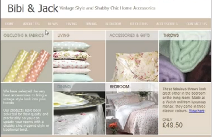
Here we have a relatively small site, it doesn’t have a lot of products but as you can see from the home page it’s instantly obvious what you were looking at, what they sell and by hovering over you are guided to the products right away. Also the menu makes it really easy for you to click and see the different products in different sections so it helps you instantly find what you’re looking for. Even though it’s a small site it’s well-organised and presents the products well.
But what if you have more products? Well let’s look at a little bit larger site.
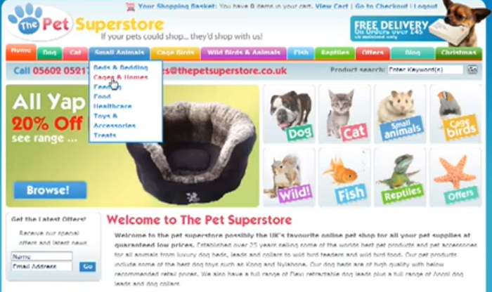
Here is a site, it’s quite a bit larger than the first one, but as sites go not that big, but you can see it is instantly obvious what’s being sold and what’s being displayed. It also guides you with your interests, if you are interested in dogs or cats or wild animals. You are instantly shown how to find those products. Also the navigation is very clear, again it’s very easy to find what you are looking for quickly and go to it. And you can see that the design is still very pleasing so the design doesn’t get in the way of navigating and shopping on this site.
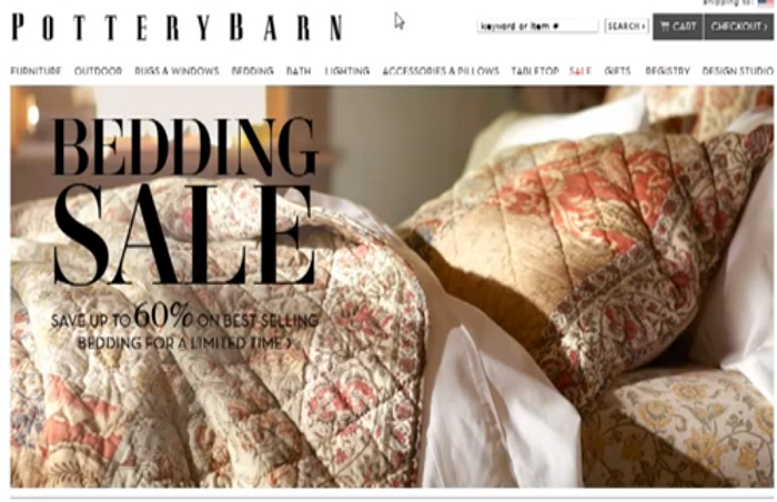
But what if you have a really large site with maybe thousands of products? Let’s look at an example.

Here this common home furnishings company has a lot of products to sell, but instantly upon landing on their page you know exactly what you are looking at, you know what their product is and you are instantly guided to the various departments. And the navigation again is very easy to understand and navigate it takes no thought-time or training to figure out what you are looking for.
So the theme of all three of these sites we just looked is simple; it’s easy to shop and provides a familiar experience. Regardless of the size of your store inventory design your store to be easy to navigate and defined what your customers are looking for right away. This may mean giving up some creative freedom and following more traditional lines, but increase profits will make it worthwhile.
Sadhiv Mahandru has been involved in online marketing for over a decade covering PPC, Affiliate Marketing, SEO , Content Creation and also creating effective websites. Specialising in SEO Company Manchester UK and providing services throughout the UK. You can learn more about Internet Marketing and SEO by reading my own blog which is updated frequently.