
The web design community has been abuzz with conversations about responsive web design. This new web design philosophy is changing the way modern websites are being made. Unfortunately, the owners of the website have been slow in adopting this new way due to a failure to understand what responsive web design (RWD) is and its usefulness to your website. Here, we address those two issues and hopefully get you ahead of the competition.
What is responsive web design?
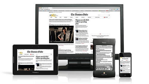
The responsive web design focuses on the plurality of devices, screen sizes, and screen proportions out there as the foundation of the design process. Advances in the technology world have created an effusion of devices in the market with all sorts of screen sizes, proportions, and capabilities. This, combined with an increase in the network capabilities of these devices for increased mobile internet access, has created a need to re-evaluate how websites are made.
Must Read: What is Responsive Web Design and its Importance in Business?
Must Read: The 6 Best Resources For Responsive Web Design
A good website is easily accessible through any device in the market. Reductions in screen size and device processing power should only limit a very small part of the functionality of the website. Responsive Web Design addresses this issue. It creates a website that can be viewed excellently across any type of device.
The traditional answer to mobile computing needs has been to create a mobile version of the original desktop website. This, however, limits functionality across powerful mobile devices which tend to have larger screens. It also means having to implement SEO and marketing strategies repetitively.
Why you need Responsive Web Design?
1. Go Mobile
Internet access is increasingly shifting to mobile devices. More people access websites through their phones than their desktop devices. A business website must be accessible to the consumers regardless of the device they are using. Going mobile makes the business accessible to customers on the go. Internet research companies have shown evidence that proves that people are increasingly searching for businesses on the go. Furthermore, the number of searches performed for businesses from mobile devices is projected to keep growing at the current exponential rates. The result is that businesses must go where their clients are or risk suffering.
2. Cost Effectiveness
There are two ways to respond to the mobile surge; use Responsive Web Design or create a mobile version of your desktop website. Creating a mobile version is a resource intensive project. Furthermore, this duplicates the processes undertaken to manage and update your websites. The result is increased expenditure in terms of hosting, administration, support services, and auxiliary services for your business. Running two websites is not only costly directly, it has indirect costs also; if you intend to employ a communications or marketing strategy, you have to do so twice. Responsive Web Design, on the other hand, creates a single website that responds to the needs of any device. Administration, updating, and any other tasks are performed once making it the clear choice.
3. Increased Search Engine Rankings
Search engines monitor the feedback customers give on websites they redirect them to. A high rate of positive feedback from both mobile and desktop users increases your rankings on the search engine result pages. Furthermore, when you use Responsive Web Design your SEO efforts need not be split between mobile and desktop users. The search engine crawlers have a much easier time accessing all of your content if it is in one web site. Additionally, all your traffic is counted as a single entity which leads to better rankings due to increased popularity. In fact, Google has gone so far as to recommend Responsive Web Design as its preferred industry standard.
4. Access a Larger Portion of the Market
Consumers only respond to websites that are easy to access and use from any device. You have to reduce the loading time of your website on mobile devices. Failure to use Responsive Web Design leads to slow leading sites, which result in frustration quits. Consider a larger percent of the population has access to a mobile device than that with access to a desktop device. By using RWD, you access this entire market.
5. Increase Marketing Space
Mobile versions of websites are stripped of all unnecessary features. When loaded from a Smartphone or tablet device, this is a waste of potential. Marketers usually use the space in the margins to promote other products/services. Responsive Web Design allows the page to load marketing and advertising items when accessed from devices with larger screens.
6. Stay ahead of the curve
Businesses are only recently realizing the potential of Responsive Web Design to boost their business revenue. A large number of your competitors may be yet to find out. In the online realm, staying ahead is the key to success.
With Google having endorsed Responsive Web Design as its preferred web design method, the case is effectively closed. Search engines rule the online business world, and it is best to follow their guidelines.

Infographic By Hall Internet Marketing – Responsive Website Design – What is it?
About Guest Author
This post is shared by Mayank Kaushik from RiaEnjolie.com. RiaEnjolie offers high-impact small business Websites as well as mobile website design services to help grow your businesses. You may follow them on twitter @RiaEnjolie


Mayank responive web design is the need of the day , i have noticed as well , with people finding it difficult to access sites on smart phones ! Thanks for sharing the details !