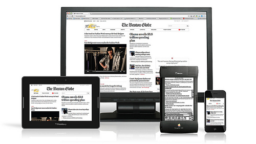
The way people browse online is changing. Instead of surfing the ‘net from our homes and offices we are increasingly doing it on the move using tablets and smartphones. This represents the need for a major shift in strategy and approach, especially for e-commerce.

The latest report from NewMedia TrendWatch estimates up to 50% of hits to an e-commerce site now come from a mobile device. This figure differs around the world but it illustrates that to appeal to a new generation of consumers, it is becoming more important to have what Web Monkey describes as a One Web Approach. This means having a universal online browsing experience, being able to access the same information, branding and design across a range of mobile devices. Whether through an app or a website, it impacts on the way you optimize your website for the mobile customer, wherever they are around the world.
Challenges for mobile design
It sounds simple but in facts designers and brands face distinct challenges when trying to develop a uniform browsing experience. Mobile devices, for example, do not use one operating system. Apple uses iOS, and there is also Android, Windows Phone and BlackBerry. Functionality works different on each operating system, which affects the browsing experience.
Screen size also plays a role, meaning the way a user physically interacts with your website will change depending on the size of device they are using; a tablet for example requires far less zooming in than an entry level Android touchscreen.
Practical solutions
What practical challenges and solutions does this mean you need to consider? As Web Monkey advocates design needs to be responsive, adaptive and increasingly customer-centric.
Technology and operating systems play a huge part on usability. Tech site Mashable gives tips on what to avoid. Flash, for example, does not work on Apple devices. Internationally, Apple is just behind Android, which accounts for 64% of all smartphone sales although iOS does sneak into the lead in Japan. If the majority of smartphone users in the country you are targeting use Apple devices, then if your site uses Flash they won’t be able to see it.
Drop down menus do not work well on any smartphone browser. This is partly linked to screen size as well as functionality. Similarly if images are too large they might not load well on a mobile screen, affecting the design and enjoyment of your mobile site.
The way we browse, especially on a smartphone, is different from the browsing experience on a desktop. The consumer is used to zooming in, of “pinching” the touchscreen. Yet scrolling from left to right can impact on the way a consumer reads and engages with a website.
Therefore you need to ensure your website is as customer centric on mobile devices as it is on a desktop. Avoid popups, flash and ensure there is a consistency of branding. Make it as easy to view different products and information via a mobile device as it is with a mouse or touch pad at your fingertips.
Reaching an international market

Inevitably, all your customers will not be in one place.If you are targeting customers internationally, or in a specific country, it is important to understand how smartphone and mobile device usage might compare around the globe. In Japan, for example, it even has its own name; Keitai Culture defines how consumers engage with and use their mobile devices. Masanari Arai, the cofounder and CEO of Synclore Corporation in Tokyo writes in VentureBeat that because gaming is such an important part of the Japanese online and mobile experience it is worth exploring how this can be incorporated into a mobile browser.
In Japan e-commerce is ruled by mobile devices. Both Amazon and Rakuten estimate 60% of all of their purchases come through mobile in Japan. This is much higher than in the US and Europe. Analysts believe it is because the commute in Japan is largely done by train, leaving much more time for browsing. This compares to the majority of Americans who drive to work.
In Korea under half of the population owns a smartphone. Yet e-commerce here is dominated by app usage. This is because in such a small country it is easier to guarantee high data connection speeds for more people. When customers are browsing on their mobile device they are more likely to use an app to do so. Perhaps to target Korean customers, therefore, an app is better than a mobile website?
For many US brands they are keen to tap into the Chinese market – the biggest smartphone market in the world with over 330 million subscriptions. Here there is no Google Play but Android dominates iOS (although it is catching up). A factor to remember, however, is the Great Firewall. As well as blocking social networks like Facebook and Twitter it blocks “inappropriate content”. The language, content and design all need to meet the guidelines established by the Chinese government if you are to reach consumers via a mobile device.
Breaking the language barrier
To talk directly to your target audience inevitably a website needs to be translated, whether on a desktop or a mobile device. A professional translator or local copywriter can help ensure the language used is accurate. Free online service like Google Translate tend to be inaccurate and are particularly poor at handling colloquialisms, which can alienate native speakers. This also includes SEO terms and keywords to make it easy for customers to find your website through search engines.
Successful mobile optimization
To engage with customers around the world it is vital to have a mobile optimized website. Functionality and adaptive technology ensure the site will work on different platforms, as well as fitting with the behaviour of the online consumer and taking into account trends and cultural differences around the world. Testing the site on different platforms and with target audiences is of the utmost importance ahead of launch, to ensure it works effectively and efficiently and maintains a uniformity of brand, no matter what device the customer is using to view it.
Article by Christian Arno, the Managing Director of Lingo24, Inc..

I’m no longer certain where you are getting your info,
but great topic. I needs to spend a while learning
much more or understanding more. Thanks for fantastic
info I used to be searching for this info for my mission.