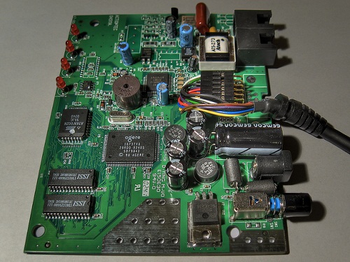
I hate to remind you of the days of the 14.4 Kbps modem, but you must remember the anticipation of watching a small image load one horizontal line at a time as your “high-speed” modem gobbled up the bits through your phone line at a blazing speed of 14,400 per second. Part of the allure of the internet at that time was viewing images from around the world regardless of how long they took to appear on the screen.
 Image Credits Razor512 via Flickr
It’s a little different now that we can download images and video almost instantly. Just this week I upgraded my internet speed and am now downloading at about 23,000,000 bits per second. That’s over 1500x faster than my 14.4 modem!
But just because images are downloaded in a flash doesn’t mean we should view them as less valuable. Too many online publishers use poor images or none at all on their sites and are unknowingly paying the price.
Must Read: Where To Find Images For Website Design And Online Media
We should all learn from the past and reminisce back to the days of slow-loading images and the 14.4 Kbps modem.
Remembering how much every image meant to us when it loaded at a snails-pace should hint at how much images STILL mean to your website visitors. Here are a few reasons why images, even though they load on our screen in only milliseconds, are still precious and not to be overlooked.
1. Images Grab Attention
Internet usage statistics tell us that our website visitors are fickle. They will leave a site in seconds if it doesn’t capture their interest. An easy way to grab attention is with an engaging title and intro but even that requires a visitor to stay on your site for a few seconds. A few seconds is a long time considering most website visitors bounce from a web site within 2 seconds.
With the quick twitch of their eyeballs, your visitors can view a picture that is worth a thousand words. The picture, if it’s high quality and engaging, may be enough to keep the visitor on your page just long enough to get hooked on your other content. This simple addition of the right picture might be the difference between 1 new conversion or 10 new conversions in the next month.
2. Create the Feeling of Progress
 Image Credits Adreson Vita Sá via Flickr
No one has enough time these days and many people will leave a web page immediately if confronted with a huge block of text that is the full width of the screen. It’s one of the best ways to scare your website visitors away fast.
Adding a picture to the top of a page or blog post has an effect beyond just grabbing attention as mentioned above. If a picture is aligned to the left or right at the top of the page, it will narrow the width of the text content just like this paragraph. Don’t you love how fast you are flying through this paragraph because the lines are so narrow? You’re not actually reading it much faster than if it were full width but it’s giving you a feeling of progress and making it easier to move from line to line.
It’s one of the reasons that magazines and newspapers use small column widths. It creates the feeling of progress and ease. Why not do the same consistently on your website?
3. Magazine vs the Novel – Know your audience
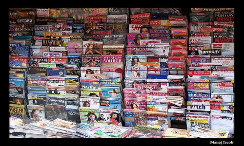
 Image Credits Manoj Jacob via Flickr
It’s important to know your audience when designing the layout of a writing piece. If you are a novel writer, it’s pretty safe to assume that your readers are expecting pages full of text. Pictures are not much of a concern except for maybe the front cover.
On the other hand, a magazine editor is concerned with pictures just as much as (if not more than) text. Magazine readers expect to be engaged by the imagery and may even decide which articles to read based on the graphics.
So where do website visitors fit into this spectrum? … I would say somewhere in between novel readers and magazine readers. Depending on the target demographic for your website, you must achieve a balance of text and images. Unless your site is exclusively video, your readers are coming to your site expecting to read so you have to provide useful and engaging content in text format.
But since they are probably not still using a 14.4 modem, they are hoping to have a multimedia experience as well. They don’t want to be bored out to tears reading a huge block of text.
Give your readers what they want and put in the time to include engaging and appropriate images that enhance the experience. If it is worth your time to write the text content for a page, then it is worth the time it takes to create and add the images that can capture attention and add tremendous value to your content.
If you still have a dial-up modem in a box somewhere, go grab it and put it on your desk as a reminder of the slow-image days.
 Ryan Bowman applies these design principles when building sites for his 200 small business clients at WebEminence.com. He launched an affordable web design service for small businesses that don’t have the budget for a custom website design, but still want their site to look awesome.